Case Study
Carrier: Real-Time Device Monitoring
CONTEXT
Prior to this project, the only way Carrier had any visibility into their devices was when a technician was on-site with them. This meant many technicians, spending lots of travel time only to then manually read and service the devices.
To help provide visibility into these devices at an aggregated level, Carrier had worked with Microsoft to install IoT enabled sensors on a number of their devices. This was great because it output so much data to the cloud that they otherwise would have had to be on-site to get.
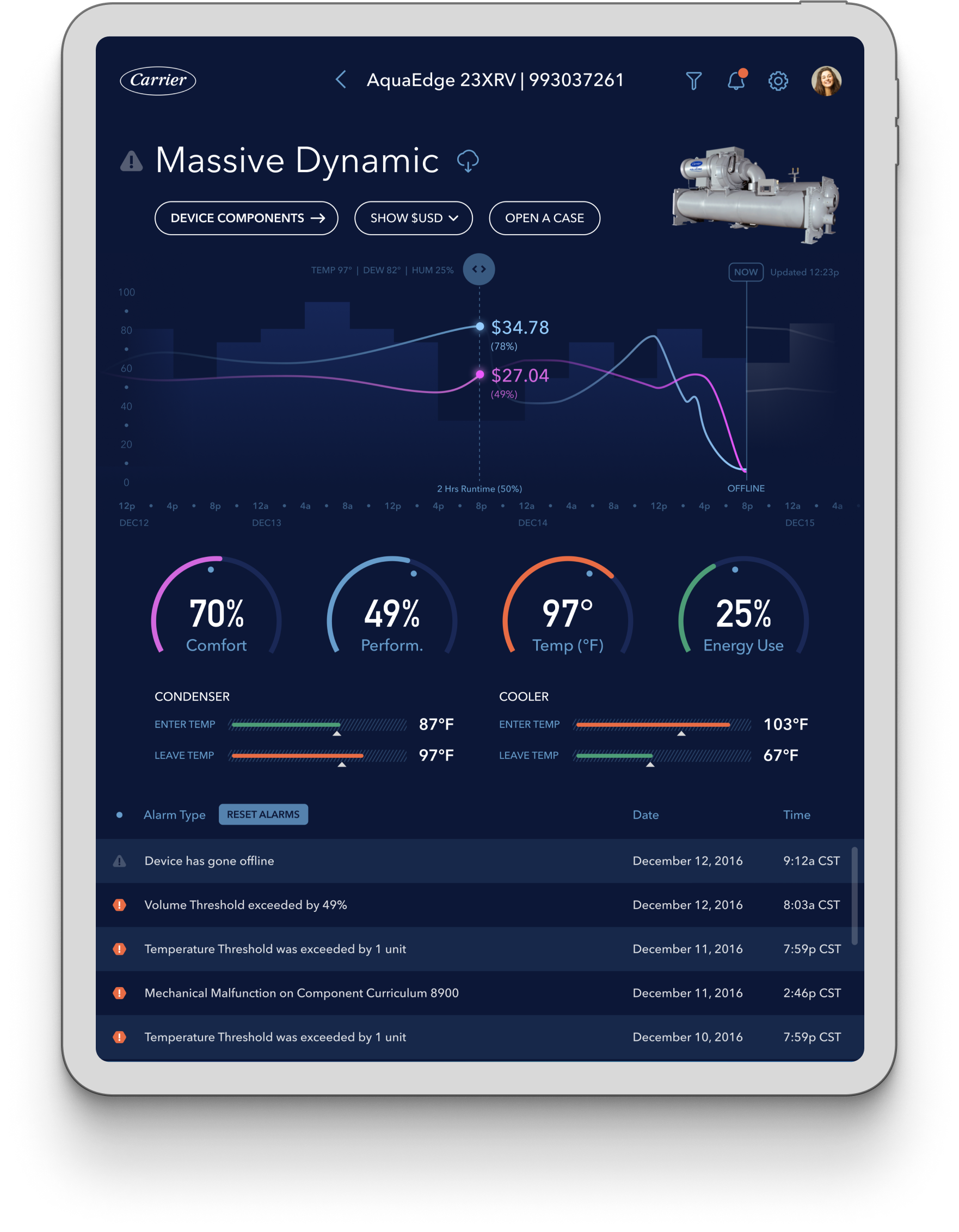
The real opportunity though was what we could do with all that data. Microsoft brought us in to work with Carrier, their technicians, and call center reps to design a tablet application that helped better monitor devices of theirs that have been installed across the globe.

The early days of IoT.
THE OPPORTUNITY
Create a real-time app experience that allows technicians and call center reps to identify device issues, and better predict their maintenance needs.
Having the data is only the first step in telling a better story.
First, we met with some of the data subject matter experts to better understand the devices that were sensor enabled, along with what all this data meant. Then we spent a good deal of time meeting with technicians and call center reps to understand what insights they were trying to glean from it all, and what information was important to be surfaced to the top. We needed to dig into what decisions they made on a regular basis, and how certain data correlated to what those decisions were. That would help inform how we organize the data and surface insights at various levels.
Capturing key needs for call center reps and technicians:
Getting the lay of the land and creating an intuitive hierarchy.
It was really important to us that we nailed the hierarchy of how these devices were thought of when it comes to monitoring and maintenance, in addition to how the various business and mechanical alarms roll up through it all.
Researching existing paradigms to make it easier to adopt.
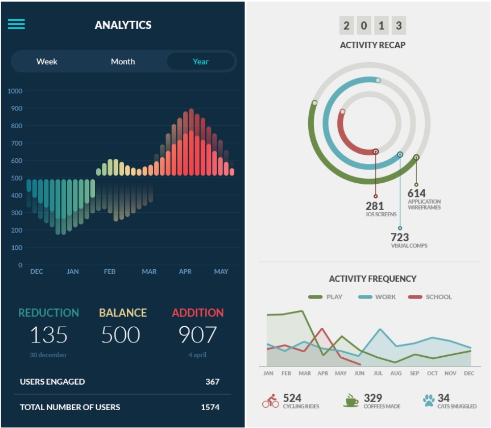
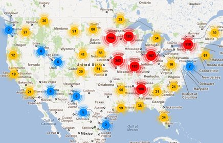
We wanted to create a great experience, but we also didn’t want to reinvent the wheel just because we were working with newer technology in the hardware. We benchmarked some different experiences and tried to utilize existing UX paradigms, gestures, and visualizations. Apps like Zillow, Google Maps, and various activity monitoring dashboards.
Wireframing the core UX for the POC to allow for future scale.
Due to this project not being a comprehensive application design, we had to make sure that we were creating a strong foundation for the future roadmap of the product — without fully knowing what that is. A few things we needed to keep in mind in order to achieve this:
1. Creating a hierarchy in how the app flows, in addition to the content across each view.
2. Avoiding congestion in the UI, and not doing anything too fancy for data visualizations.
3. Making the assumption that there will be more data and more data types to accommodate.
Positive indicators for the first batch of wireframes.
We got some great feedback from call center reps, technicians, and business stakeholders. Most of which was overwhelmingly positive and helped validate the direction, but there was a strong desire to see more functionality that assisted with predictive maintenance. This was going to mean big time savings, in addition to cost savings because orders would be more efficient (packing costs, quantity parts discounts, number of shipments, etc.). While this wasn’t in scope for the initial POC, we added it to the roadmap so that we could prioritize it during the next engagement.
Crafting a visual design system that engages and delights.
Testing the first round of design prototypes with real users.
With a tight timeline came the need to operate and iterate quickly, making sure that we were capturing essential feedback while also ensuring we managed expectations for the POC phase of this project. With users knowing this was only a “phase 1” it was great to see what an application like this does for people that were operating in such a manual fashion for so long. Take a look at some of the user rating increases and decrease in average customer service call times!


