

Case Study
Arccos: New In-Play Experience
CONTEXT
Arccos is a golf technology and data company that is looking to do big things in the industry with tracking golfers’ games across the world. I joined Arccos after them having a nonexistent design organization, with very little thought into the user experiences that users were getting with their products.
The biggest opportunity was to bring thought leadership and UX strategy to the most used feature at the company: The In-Play Experience.
This part of the app was where users would start a round of golf and we would automatically track their shots, give them adjusted yardages for their targets, and allow them to add/adjust various data points along the way to give them more accurate insights afterwards.


Track your game like the pros.
THE OPPORTUNITY
Dive into the golfer psyche and give users a compelling in-play experience that has them leaving feeling like they can’t play without it.
Taking stock of the existing in-play functionality.
Coming into a new company with products that are new to you is always exciting, but it’s so important that before you rush in and start creating, that you understand where the product has been and why things have been done certain ways. In doing this, we actually uncovered a few features that even some people in the company didn’t know about!


Getting feedback from users, beta testers, and internal stakeholders.

Organizing around a lot of functionality and user feedback.
It felt like we had so much ammunition to jump in and get started, but I wanted to make sure that as a team we rallied together to try and chunk out what it is that we were going to be tackling. We scoped the project down to strictly in-play functionality, meaning we wouldn’t be addressing anything before a user starts their round or after they end their round. We also went through a naming exercise to help ensure we were all on the same page in terms of what chunks of work we were all talking about on a day to day basis.

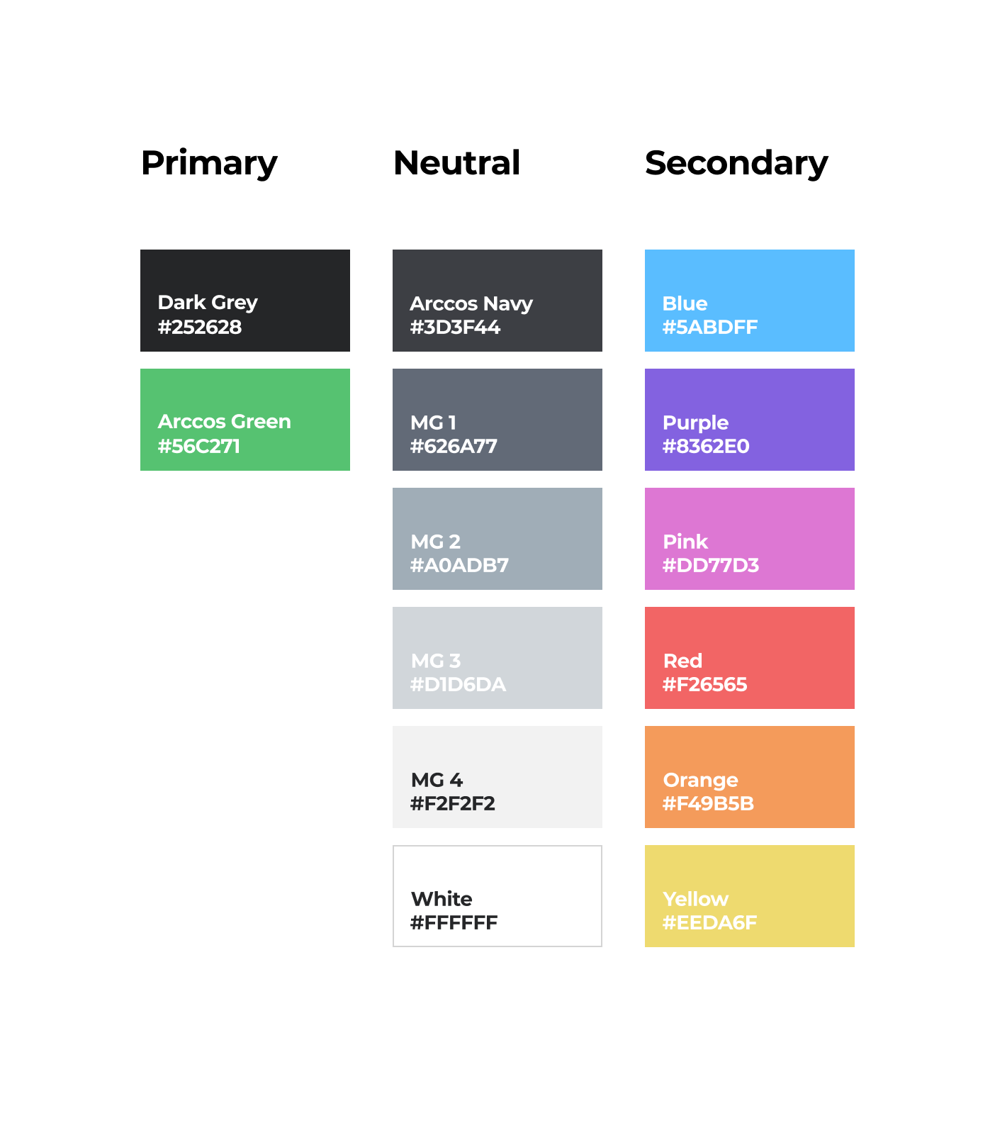
Creating a design system to help standardize the look and feel.
There had never been a standard design system at the company. In fact, it was even hard for me to get my hands on any brand guidelines. So, things like typography, colors, UI elements, etc. were a bit disjointed to say the least — but that was part of the fun with this project! We worked with the product, marketing, and operations team to iterate on existing products and properties to start to evolve everything towards a single thread of consistency. Here’s a small glimpse:


Thinking about the experience at a broad and scalable level.

Something new, but familiar.
One thing we heard from users is that they don’t want to spend too much time trying to find things, but it seemed they also felt comfortable with some of the broader UX that the app had. For example, we had originally tried bringing the hole navigation to the bottom, and people said that it was “unfamiliar.” They added that it felt odd being so prominent when they almost never used that function, since holes switch automatically.

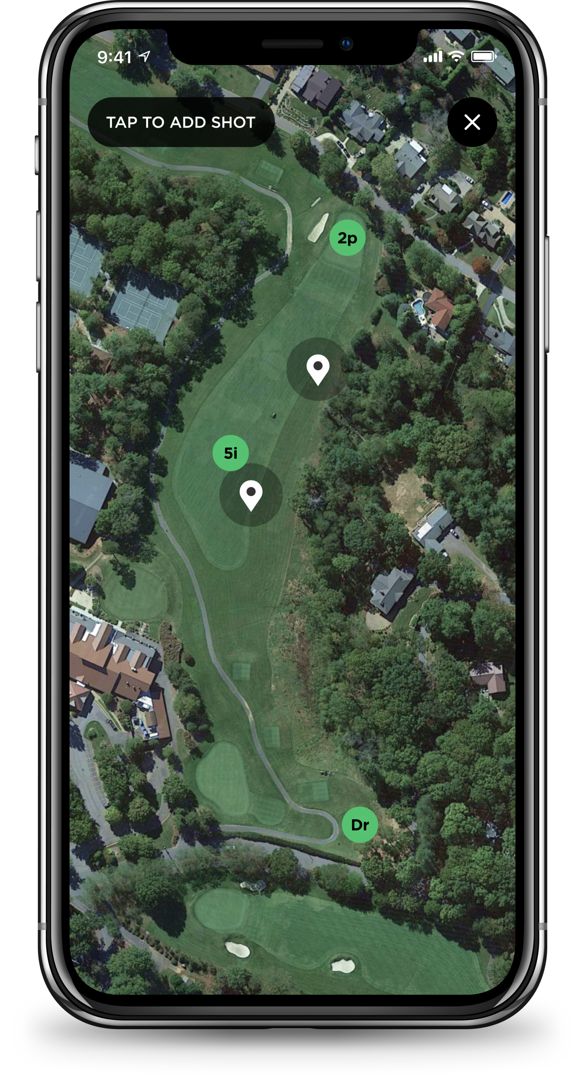
Cleaned up hole navigator.
People made it clear they liked the location and general usability of the existing hole navigator. We stubbed out a few forward-thinking concepts to allow the user more flexibility with round settings and shot tracking adjustments, but we mostly kept things the same. We did take a pass with our new design system and utilized better spacing and larger touch points.
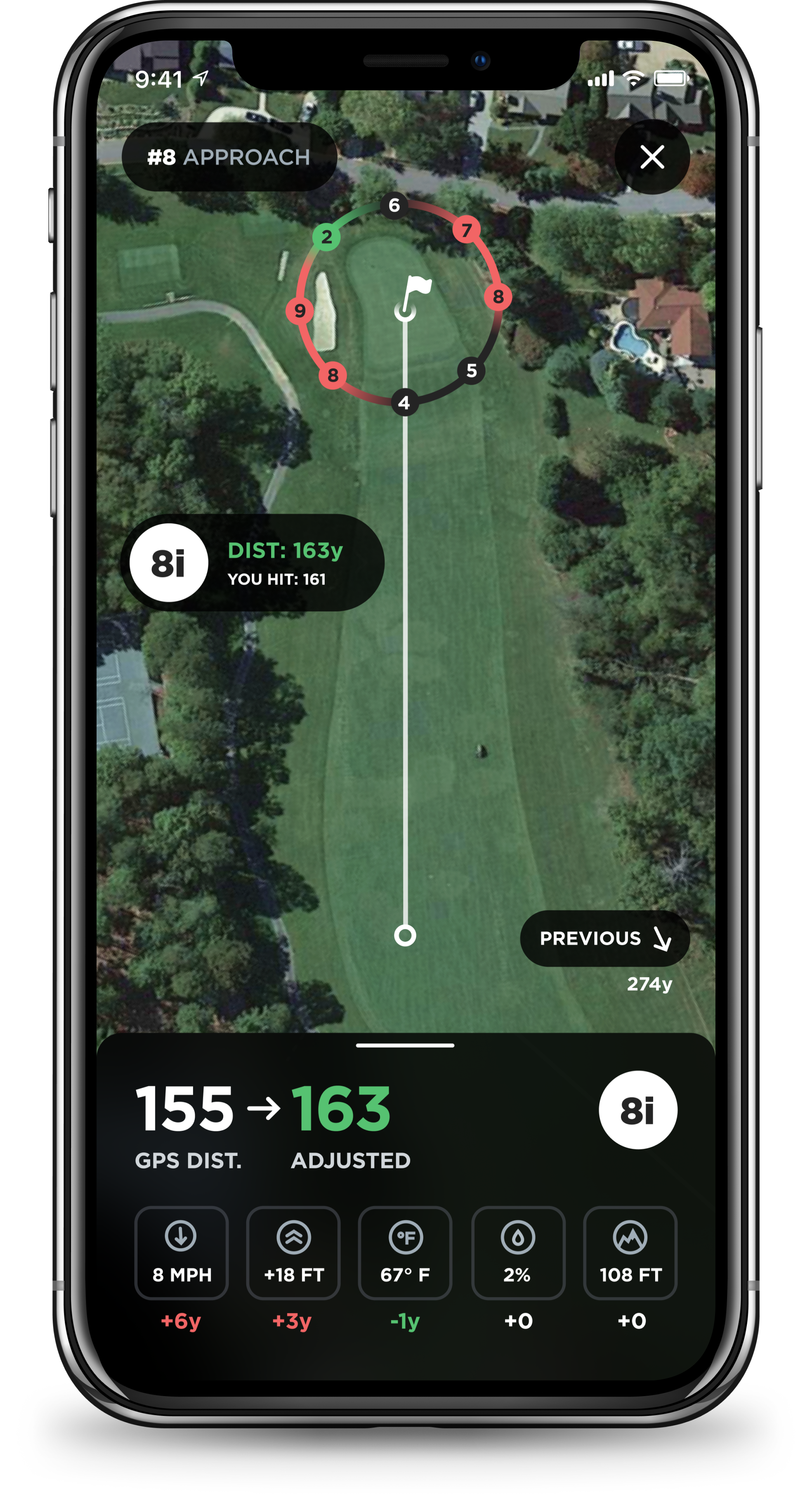
Contextual bottom tray.
While we didn’t invent the bottom tray, this is probably the biggest innovation we’ve had at the company for the in-play experience. We were really able to tap into the different scenarios users described to us, and we crafted several different trays of content depending on which situation they were in. Each of those trays also had expanded and collapsed states just in case they either wanted to dive deeper or keep things a bit more high level.

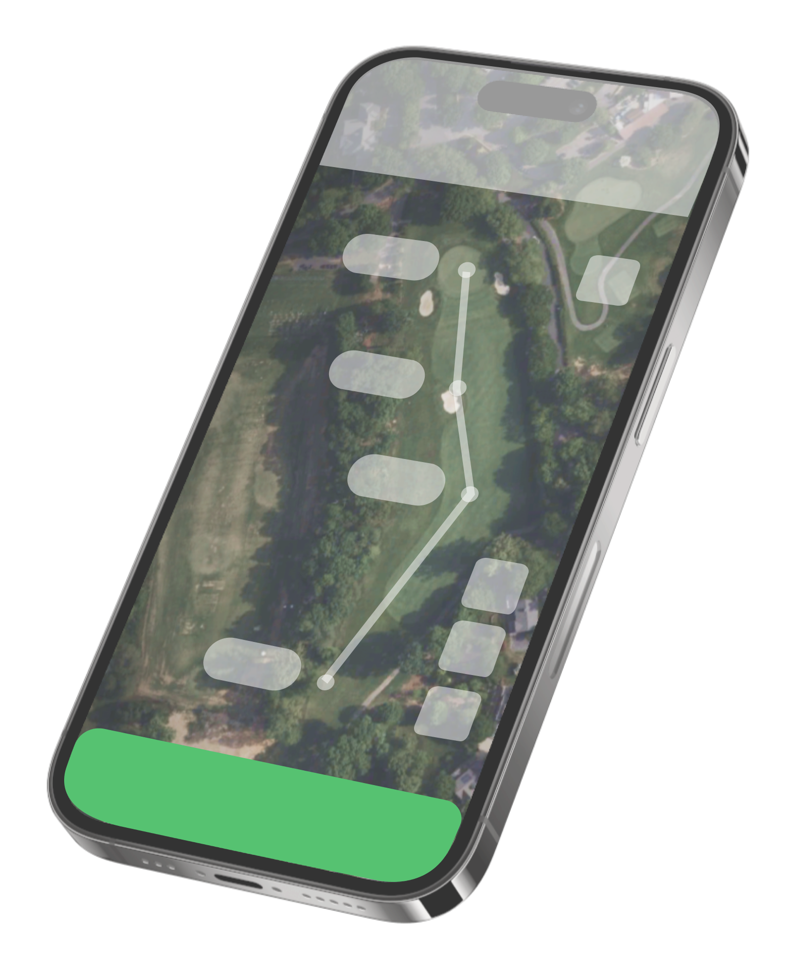
Actionable map elements.
We tried to go by the logic of, “if it feels like you should be able to interact with it, make it obvious” mindset. With our various rangefinder and shot pills, we’ve included expanded states for things like edit mode, move shots, and simply drilling into the data for each one further. Utilizing a more mobile friendly design system helped users be more aware of what elements in the UI they could interact with.

Consistent actions column.
We had a big problem in our old in-play experience, and that was that the UI became a junkyard for all these badges that no doubt got stuck on because there weren’t any other great places to put them. We decided that we were going to create a very dependable and sticky action column to house the three most utilized features, plus a “tools” tray for additional features and views that may come down the road.
We validated this direction with users by prompting them with fairly vague tasks, and asked where they might look to accomplish them.
This had it’s own challenges since there wasn’t much detail in the screens, but what we did was label the elements in a basic way that gave the testers an idea of what each area represented.
Designing out the experience and testing along the way.


Stellar response from our users.
We’ve been chunking out releases over the past several months, and the feedback from users has been overly positive. The speeds have increased, we implemented live maps which allowed better visual access to the course, and we gave people an in-play experience that they seem to be adopting easily and utilizing heavily. Check out the increase in post-round app ratings!